Small local coffee shop seeking logo creation and brand development. They wanted their logo to incorporate a coffee-related element while maintaining a minimal and clean aesthetic. The client expressed a preference for calm, muted tones and wanted to avoid bright colors to preserve a relaxed feel. They were open to creative ideas but emphasized the importance of including the shop’s established date within the logo design.
Personal Project
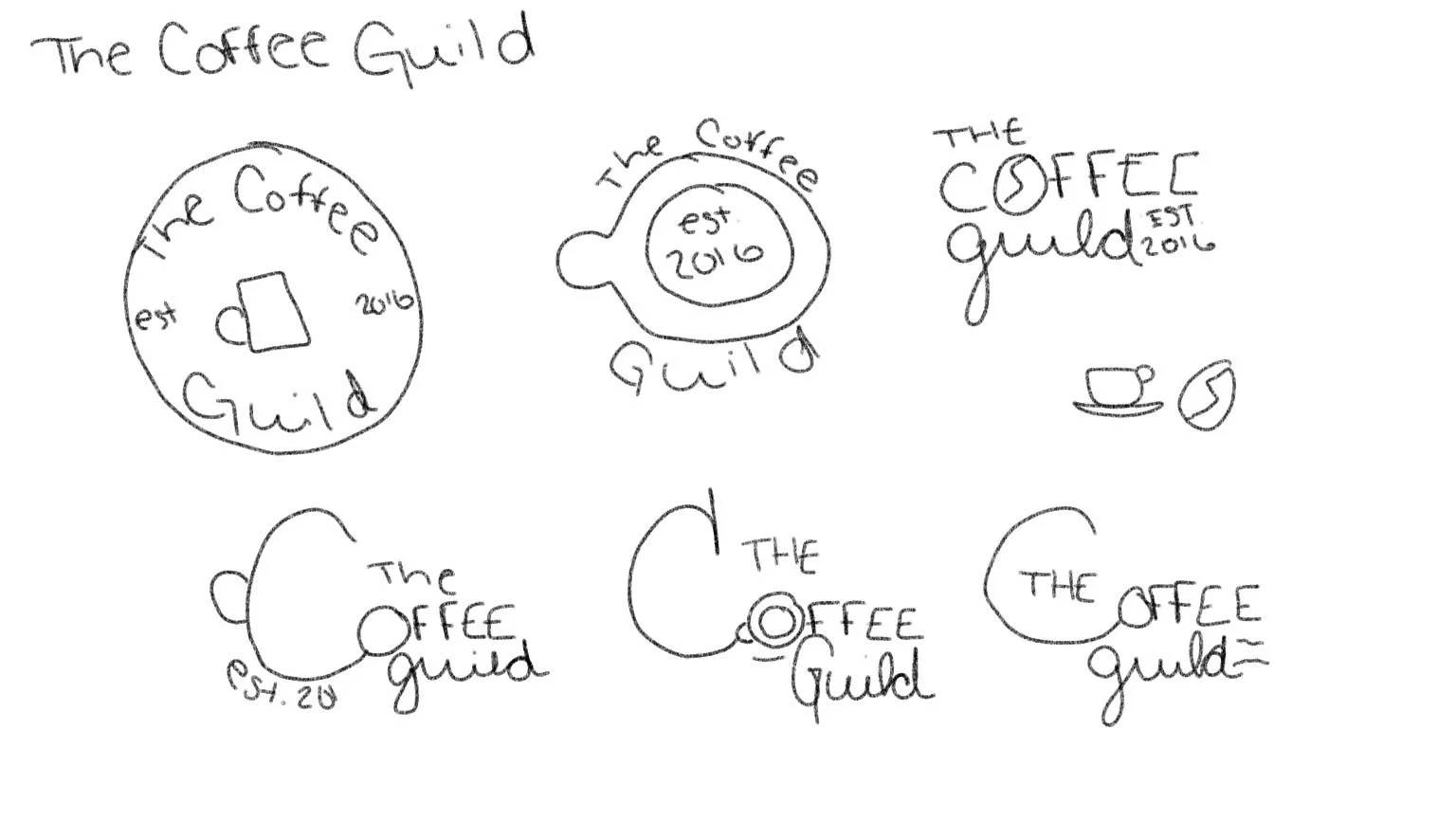
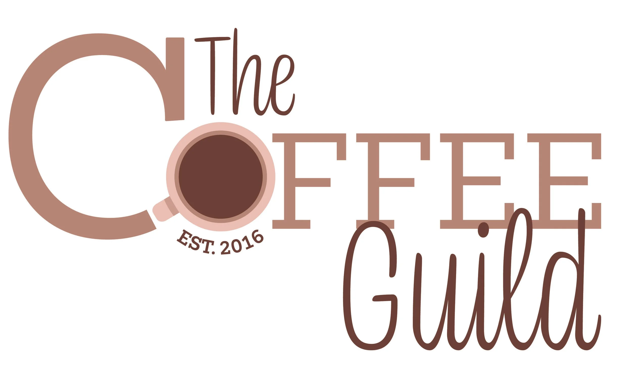
I wanted to incorporate a coffee cup or coffee bean into the logo, so I began sketching ideas by hand. I created several variations, experimenting with different sizes and placements for the established date. One concept I particularly liked was transforming the “C” in coffee into the shape of a mug. After exploring multiple directions, I ultimately chose to keep the logo simple by incorporating an aerial view of a mug into the design. The chosen typeface balances cursive and serif elements, creating a blend of expressiveness and minimalism.